Every organisation has absence data. Very few organisations actually use it. The numbers sit in a leave management system or a spreadsheet, quietly accumulating, while HR teams react to problems that those numbers could have predicted weeks or months in advance.
The shift from reactive absence management to proactive leave analytics is not complicated. It does not require a data science team or expensive business intelligence tools. It requires knowing which patterns matter, setting aside fifteen minutes a month to review them, and having the confidence to act on what the data tells you — even when the signals are subtle.
This guide covers the specific absence trends worth watching, how to build a simple analytics routine, when data warrants action versus when it is just noise, and how UK-specific frameworks like the Bradford Factor and CIPD benchmarks fit into the picture.
Why Most Organisations Fail at Absence Analytics
The problem is not a lack of data. Modern leave management tools capture every request, every approval, every sick day, every pattern. The problem is that most organisations only look at this data in two situations: during annual reviews and when there is already a crisis.
Annual reviews are too late. By the time you are summarising last year’s absence rates, the damage is done — the burned-out employee has already left, the understaffed team has already missed their targets, and the pattern of Monday absences has already become a cultural norm.
Crisis mode is worse. When HR gets pulled in because a manager is frustrated about a team member’s attendance, the conversation is already adversarial. Nobody is at their best when they are responding to a complaint rather than getting ahead of a trend.
The organisations that handle absence well are the ones that build a simple, consistent review habit. They look at the data regularly, they know what normal looks like for their organisation, and they spot deviations early enough to have supportive rather than disciplinary conversations.
The Patterns That Matter
Not all absence data is equally useful. Here are the specific patterns that reliably indicate something worth investigating.
Monday and Friday Absence Spikes
This is the most frequently discussed absence pattern, and for good reason. A consistent pattern of absence clustering around weekends can indicate morale issues, disengagement, or a workplace culture problem.
However, context matters enormously. Some Monday/Friday variation is normal — people schedule medical appointments on days adjacent to weekends, parents are more likely to need emergency childcare on Mondays, and genuine illness does not follow a neat mid-week distribution.
What to look for: The key word is “disproportionate.” If your Monday sick absence rate is consistently thirty to forty percent higher than your Wednesday rate over a period of several months, that warrants investigation. A ten to fifteen percent difference is likely within normal bounds.
What to do: Do not jump to accusations. Start by looking at team-level data. If the pattern is concentrated in one team, the issue is likely local (management, workload, team dynamics). If it is organisation-wide, it may point to a broader culture or engagement problem.
Seasonal Trends and Predictable Peaks
Some seasonal patterns are entirely expected — higher annual leave in August, more sick absence in January and February during cold and flu season, a spike in requests around school holidays. These are not problems; they are facts to plan around.
The interesting patterns are the unexpected ones:
- Post-holiday sick leave spikes — A surge in sick days in the first week of January or immediately after the summer break can indicate burnout. Employees who should be returning refreshed are instead too exhausted or demotivated to come in.
- Pre-deadline absence — If you notice absence clustering in the days before major deadlines or reporting periods, workload and stress may be the driver.
- Seasonal affective disorder (SAD) patterns — A noticeable increase in sick leave from October to February, particularly among employees who work remotely or in offices with limited natural light, may warrant wellbeing interventions.
Team-Level Disparities
This is one of the most actionable metrics available to HR. If one team’s absence rate is significantly higher than the organisational average, something is happening within that team that deserves attention.
Common causes include:
- Management style — Teams with overly demanding or unsupportive managers consistently show higher absence rates. This is one of the most well-documented findings in organisational psychology.
- Workload imbalance — If one team is chronically understaffed or over-committed, stress-related absence follows.
- Team culture — Some teams develop a culture where taking sick days is normalised beyond genuine need, often because the work itself is unfulfilling or the team dynamic is poor.
- Physical work environment — This is more relevant for office-based teams. Poor air quality, inadequate heating, or noisy open-plan environments can directly drive absence.
Benchmark: According to CIPD’s Health and Wellbeing at Work survey, the average UK absence rate is approximately 7.8 days per employee per year. If a team is consistently above this, it is worth a closer look. If they are double it, there is almost certainly an underlying issue.
Individual Patterns That Signal Burnout or Disengagement
Individual absence data is sensitive territory and must be handled with care. But certain patterns are early warning signs that, if addressed supportively, can prevent an employee from reaching breaking point.
Patterns to watch:
- Gradual increase in sick leave — An employee who averaged two sick days per year and is now on track for eight has something going on. It might be a health condition, caring responsibilities, or workplace stress.
- Unused annual leave — Counter-intuitively, employees who never take time off are a higher risk than those who take all their entitlement. They are more likely to burn out, and when they finally do take leave, the recovery period is longer.
- Short, frequent absences vs long, infrequent ones — Multiple single-day absences spread across the year often indicate a different underlying issue than one extended absence. The former may suggest chronic stress or disengagement; the latter might be a genuine health event.
- Leave requests retracted or modified repeatedly — An employee who keeps booking and then cancelling leave may be struggling with workload that makes them feel they cannot step away.
Important: Individual absence conversations should always be supportive and private. The goal is to ask “how can we help?” not “why have you been off so much?” If your data surfaces a concerning pattern, approach it as a welfare check, not a performance issue.
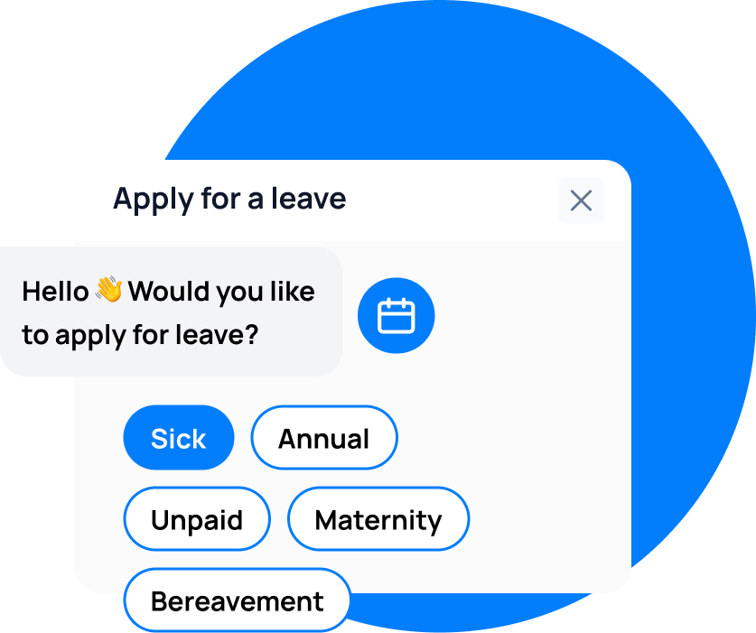
leave emails? Track your employee's leave with Leave Balance
The Bradford Factor: A UK-Specific Framework
The Bradford Factor is widely used by UK employers to measure the impact of short-term absence. It is named after the Bradford University School of Management, where the research was originally conducted.
How It Works
The formula is:
B = S x S x D
Where:
- S = the number of separate absence episodes in a rolling period (usually 52 weeks)
- D = the total number of days absent in that period
The squaring of the spell count means that frequent short absences score much higher than a single long absence of the same total duration.
Example: An employee who is absent for ten consecutive days has a Bradford Factor score of 1 x 1 x 10 = 10. An employee who has ten separate single-day absences has a score of 10 x 10 x 10 = 1,000. Same total days absent, vastly different scores.
Bradford Factor Trigger Points
Most UK organisations use a tiered trigger system:
| Bradford Factor Score | Typical Action |
|---|---|
| 0-49 | No action required |
| 50-124 | Informal conversation with line manager |
| 125-399 | Formal first warning or occupational health referral |
| 400-649 | Final written warning |
| 650+ | Consideration of dismissal |
These thresholds vary by organisation, and many employers adjust them based on their industry and workforce profile.
When the Bradford Factor Is Useful (and When It Is Not)
The Bradford Factor is a useful screening tool. It highlights employees whose absence pattern is unusual and may warrant a conversation. It is objective, easy to calculate, and widely understood.
However, it has significant limitations:
- It does not distinguish between reasons for absence — An employee with a chronic health condition protected under the Equality Act 2010 will score highly, but disciplinary action based on their Bradford Factor score could constitute disability discrimination.
- It penalises short absences over long ones — This is by design, but it can feel punitive to employees who are genuinely unwell but recover quickly.
- It is backward-looking — The Bradford Factor tells you what has already happened. It is less useful for predicting future absence patterns.
In Leave Balance, Bradford Factor calculations can be configured and automated. The system flags employees who cross trigger thresholds, and managers receive a notification with the context needed to have an informed conversation. The key is to use it as a conversation starter, not an automatic escalation.
Building a Simple Absence Dashboard
You do not need complex business intelligence tools to track absence effectively. A simple monthly review of five key metrics will give you most of the insight you need.
The Five Metrics to Track Monthly
-
Organisation-wide absence rate — Total days absent divided by total available working days, expressed as a percentage. The CIPD benchmark for UK organisations is around 3.4 percent. Track this month over month to spot trends.
-
Absence rate by team or department — The same calculation, broken down by team. This surfaces the disparities mentioned above.
-
Average days lost per employee — Total sick days divided by total headcount. Easier to understand intuitively than a percentage. The UK average is approximately 7.8 days per year, or roughly 0.65 days per month.
-
Short-term vs long-term absence split — What proportion of your total absence is made up of episodes under seven days (short-term) versus episodes of seven days or more (long-term)? The drivers and solutions for each are very different. Short-term absence is often linked to engagement and culture; long-term absence is usually linked to genuine health conditions and requires occupational health support.
-
Leave balance utilisation — What percentage of annual leave entitlement have employees used to date, compared with where they should be at this point in the leave year? If you are six months in and the average employee has only used twenty percent of their allowance, you have a leave hoarding problem that will create a year-end bottleneck.
Setting Up Your Review Cadence
- Monthly: Review the five metrics above. This takes fifteen minutes if your leave management tool provides a dashboard — which Leave Balance does.
- Quarterly: Dig deeper into team-level data and individual outliers. Cross-reference absence data with any engagement survey results or turnover data you have.
- Annually: Produce a comprehensive absence report for senior leadership. Include year-over-year trends, costs (estimated replacement and productivity costs per absent day), and recommendations.
When to Act on Data vs When It Is Noise
One of the hardest parts of absence analytics is knowing when a pattern is meaningful and when it is just statistical noise. Here are some guidelines.
Act When You See
- A consistent trend over three or more months — One bad month is noise. Three months of rising absence in a team is a signal.
- A significant deviation from baseline — If a team’s absence rate is normally two percent and it jumps to five percent, that is worth investigating even if it has only been one month.
- Correlation with other indicators — Absence that coincides with rising turnover, declining engagement scores, or increased complaints to HR is almost certainly meaningful.
- An individual pattern that could indicate harm — If the data suggests an employee might be experiencing burnout, domestic difficulties, or a health crisis, act early and supportively. Waiting for more data is not appropriate when wellbeing is at stake.
Wait When You See
- A single month’s blip — Especially in winter or around school holidays. One unusual month does not establish a pattern.
- Small sample sizes — If a team has three people and one of them was off for a week, that team’s absence rate will look alarming. Wait for more data before drawing conclusions.
- Data without context — A spike in absence during a known office refurbishment, a flu outbreak, or a period of organisational change may have an obvious explanation that does not require intervention.
How Analytics Prevent Problems Before HR Gets Involved
The real value of proactive absence analytics is not better reporting — it is avoiding the situations where HR has to get formally involved.
Consider two scenarios:
Scenario A (Reactive): A manager contacts HR because an employee has had six sick days in the past two months. HR pulls the absence record, sees a pattern, and schedules a formal return-to-work meeting. The employee feels targeted. The conversation is awkward. The underlying issue — the employee is caring for an ill family member and is exhausted — finally surfaces, but only after the relationship between employee and manager has been strained.
Scenario B (Proactive): HR’s monthly analytics review flags that the same employee’s absence has increased over the past two months. HR reaches out informally — “I noticed you have been off a bit more than usual recently. Is everything OK? Is there anything we can do to support you?” The employee shares what is happening. HR helps them apply for emergency dependants’ leave and connects them with the employee assistance programme. The situation is resolved without formal process, without damaged relationships, and without the employee feeling surveilled.
The data is the same in both scenarios. The difference is timing and approach. Proactive analytics enables Scenario B.
UK-Specific Frameworks and Benchmarks
CIPD Benchmarking Data
The Chartered Institute of Personnel and Development publishes annual benchmarking data on UK absence rates. Key figures to compare against:
- Average absence rate: 3.4 percent of working time lost (approximately 7.8 days per employee per year)
- Public sector: Typically higher (around 10 days per employee per year)
- Private sector services: Around 5.8 days per employee per year
- Manufacturing: Around 6.5 days per employee per year
- Most common causes of short-term absence: Minor illness (cold, flu, stomach upset), musculoskeletal problems, and mental health conditions
- Most common causes of long-term absence: Mental health conditions, musculoskeletal injuries, and acute medical conditions
Use these benchmarks as a starting point, but remember that your organisation’s specific context matters more than national averages. An absence rate that is perfectly normal for a healthcare organisation would be alarming for a software company.
HSE Stress Indicators
The Health and Safety Executive publishes management standards for work-related stress, identifying six key areas that, when poorly managed, drive stress-related absence:
- Demands — Workload, work patterns, and work environment
- Control — How much say employees have in how they do their work
- Support — Encouragement, sponsorship, and resources provided by the organisation and colleagues
- Relationships — Promoting positive working relationships and dealing with unacceptable behaviour
- Role — Whether employees understand their role and whether the organisation ensures they do not have conflicting roles
- Change — How organisational change is managed and communicated
If your absence analytics point to stress-related absence in a particular area of the business, mapping the issue against these six standards can help you identify the root cause and design targeted interventions.
The Link Between Absence and Turnover
Research consistently shows a correlation between rising absence and subsequent turnover. Employees who are disengaged enough to take frequent unplanned absence are often in the early stages of mentally leaving the organisation. If your absence data shows a gradual upward trend in a team, check whether you are also seeing increased turnover or a drop in discretionary effort.
In Leave Balance, you can export absence data and cross-reference it with your HRIS turnover data to identify this correlation. If you spot it, the intervention is not about absence management — it is about retention and engagement.
Putting It Into Practice
Here is a practical plan to start using absence analytics effectively this month:
- This week: Log into your leave management dashboard and review your organisation-wide absence rate for the past twelve months. Note any obvious trends.
- Next week: Break the data down by team. Identify any teams that are significantly above the average.
- Set a monthly calendar reminder: Fifteen minutes on the first Monday of each month to review the five key metrics.
- Have one proactive conversation: If your data surfaces a concerning individual pattern, reach out informally and supportively this week. Do not wait.
- Benchmark yourself: Compare your rates against CIPD data for your sector. If you are significantly above the benchmark, make absence analytics a standing agenda item for your HR team meetings.
The tools are already in your hands. The data is already in your system. The difference between organisations that manage absence well and those that do not is simply the habit of looking.
leave emails? Track your employee's leave with Leave Balance